Monday, April 27, 2009
home page
I'm thinking of adding something, such as an animal, on the left side because it seems to be too much empty space. Maybe even adding something below the text in the middle space. Other than that, this is what I got.
Programs page
Graphic Standards Manual- cover page
Sunday, April 26, 2009
Wags & Wavesa Plan Page
So, this is a mock up page for the Wags & Wavesa page and I wanted to somehow incorporate the symbol in a unique pattern, but not sure if this is the right way to position it. any suggestions on what's working and what's not? Also, other ideas for a symbol pattern and which position on the page it fits best. As you will see, there are no plans added to the page just yet. I will have those added a.s.a.p. Thanks :)
Intro. Page
System Application Ideas
For those who do not know what I plan on creating, I'm making a mock website for my company, Wavesa. I will focus on creating an (enter site) page, a page for one of the 3 programs with the plans they provide, probably a page for the comparison of my competitors pricing to mine. Also, I would like to make a page that shows how the video web chat would look like as well as the home page. That's what I'm going for and I will have images up later.
Tuesday, April 21, 2009
Inspiration for Graphic Standards Manual
It was a little difficult finding really good inspirational manual images, but I came across this boomerang manual and it is simple and easy to follow. It has all the images needed for each page and has a clear index as to what these images are telling us without using much text. I was drawn to it most because it barely had any text and relies more on visuals rather than balancing image with description. It is effective and I think it could work with my company. The UNBC image was another interesting manual because it doesn't use too much text either to explain everything about the uses of the logo and fonts, etc. It condenses the information down, from the image provided, into one sheet of paper. I want my manual to be easy to use and easy to follow and these images are great for what I'm going for. Simple is better than trying to do too much with the layout and function of the manual.
Monday, April 20, 2009
last batch..
some more..
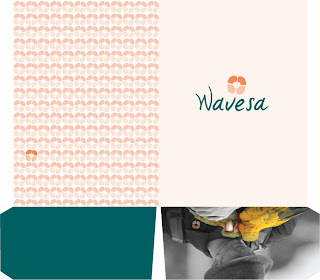
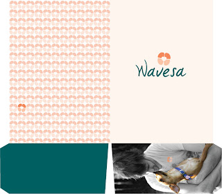
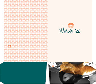
I wanted to create something for our customers once they sign up online with our company. I created folders for each program and in it will include the accordion booklet, 3 big cards(for collection) magnet, business card and a welcome card. You will also see the inside of the folder that contains the same pattern of what I included in my accordion. I did not want to leave the inside blank. The welcome card is just something for the customer once they sign up for our insurance.
Some Changes and new additions...
The back of the business cards I changed a little bit, but not too much because the layout I think works well as do the colors. The envelopes I made a little bigger and I added a 2nd one with an image applied to the front of the envelope. It was suggested to add an image so it would connect with my business cards and other elements I added. The letterhead has changed quite a bit and it looks more professional and connects with my other systems. The signature is not on the image, but there is a signature on my printed letterheads. The accordion booklet is included in the folders I created for when customers sign up with our company. It gives basic information about the 3 programs, a brief introduction for our new customers, the location of our company and what is included on our website. The layout of it, I wanted to incorporate the angle of the W in some of the pages because I use it in on the envelope and also because it is a part of my company wordmark. The angle shape is unique and adds to my identity. I think it also creates nice movement for each layout. Oh,, and after seeing Jen's design background last Monday, I decided to add a backside that contained multiples of my symbol and have one that sticks out. The spot has no meaning, but I think it is visually pleasing. I also incorporated this design to my folders.
Saturday, April 18, 2009
Some updates
I decided to to an accordion to add in my folder instead of an actual booklet and I made it small as well as the folder. I have my business cards done. All have been updated and I will post the images once I have finished everything.
Saturday, April 11, 2009
envelope
Letterhead 1 idea
business cards (front & back)
The images are for the front of the business card and the information is for the back of the business card. I decided to incorporate the pet owner as well because I felt it would be important to include them. I think I will still work on where to place the symbol for the front of the business card, but for now this is what I have come up with. thanks :)
Friday, April 3, 2009
some digital sketches
I explored ideas for my business cards and a new design for a possible letterhead. I will put up my previous sketches soon. Suggestions would be great, thanks :)
For the three business cards, I felt an image of the animals I am supporting health care for, would be great for the front of my business card. I think I will incorporate my logo on the front as well. The color framing for each is a way to incorporate that sense of the W. Using the angle of it as a way to frame my card. I experimented with the quantity of them and it would be great to know what you guys like better and also if you even like them there. Should I take them out and just have the image on the front, should I even use an image or use it for the back of the card and incorporate the framing on the other side of the card? The letterhead I am still trying to figure out. The bottom of the letterhead is supposed to provide that sense of the angle of the W as well. Using it as a way of framing the letterhead a bit, which would connect it with my business cards. Is it too much, too heavy and so on. Should I expand the symbol, and does the placement of the wordmark work? If any of this seems unclear, please let me know and I will gladly explain it more clearly. Thanks! Oh, one last thing.. the lizard image was the closest I found of an iguana almost looking into the camera, but I am still searching out for a better image to connect it with the other 2 images.
Logo update
I only changed the symbol slightly, but as for the wordmark, I edited the spacing and changed the W a little bit too. Still working on the symbol, but its progress. Oh, and I did change the color of the wordmark. It is a little bit darker and I went with the more blue green and not the purple. The symbol position is different and the size of it is smaller. Any suggestions would be great. Thanks :)
Subscribe to:
Posts (Atom)